|
"I" Font on
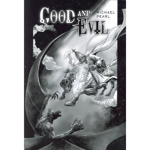
Good and Evil Cover
Shaped Like an Upside-Down Cross
The first
publication of Michael Pearl's Good and Evil book (published 2006) had a black and white
cover. The words, Good and Evil
were made with the DreamScar font.
This
gothic font
arrested my attention the moment I
saw the cover of Good and Evil because the "I" looks like an upside-down
cross! Considering the thousands of fonts easily accessible on the internet, I
question
why a font with an "I' that is shaped like an inverted cross (a
satanic
symbol
[external
site] that is on the back of the Pope's chair) was
chosen for the cover of Michael Pearl's illustrated bible, Good and Evil.

What Does the Upside Down Cross Mean?
Satanist symbol. Symbolizes mockery and
rejection of Jesus Christ.
(Quote source: Witchcraft Symbols
http://www.spelwerx.com/witchcraft_symbols.html)
Also, why did No Greater Joy select for the
cover of their illustrated bible a font that has an "O" with a triangle inside?
This is reminiscent of
point within the
circle symbolism, which they used on Michael Pearl's
Eight Kingdoms book. (A circle around an equilateral triangle is an occult symbol.)
Examine the images below and
compare the DreamScar "I" font to the upside-down cross. Note the
similarity.
  
source of Good and Evil cover image:
http://www.amazon.com/gp/product/1892112388/ref=pd_lpo_k2_dp_sr_1?pf_rd_p=304485901&pf_rd_s=lpo-top-stripe-1&pf_rd_t=201&pf_rd_i=0679724656&pf_rd_m=ATVPDKIKX0DER&pf_
rd_r=1Q1H716NVMKN603S4Q8S
source of Dream Scar "I" font image:
scanned from cover of Good and Evil
source of upside down
cross iron on
patch image: Inverted Cross Merchandise
http://www.imosh.com/SATANINSIDE/pages/INVERTEDCROSS.htm
Return to:
WARNING!
No Greater Joy Ministries: Occult
Markings -- INDEX PAGE |